The Brief
Test existing Rapha navigation with customers and assess its effectiveness. Look at the information architecture and suggest a more user-friendly approach that will enable new customers to navigate the site without much prior knowledge of the cycling industry. Create a navigation that has a better balance of content and commerce, these areas are currently very separate and by creating more links between the two, we can extend time spent on site and increase page views.
The Problem
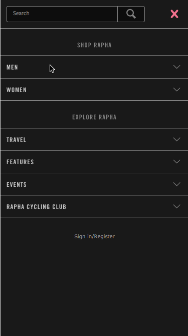
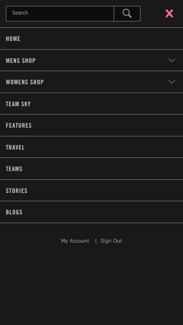
Rapha’s navigation has grown with the company, at the beginning the product catalogue was less than 10 items and so it was easy for customers to find what they were looking for. The range now exceeds 350 product lines covering a wide range of types, the navigation has grown piecemeal with the collection and has never been appraised for its effectiveness. We need to observe how the current navigation is being used and find out how our customers would expect the products to be categorised.
The Insight & Research
We know that most users on the site interact with the primary navigation, the rest use the featured items on the homepage or enter directly on a product page or category.
“87% of sessions include an interaction with the primary navigation” Rapha Google Analytics, Sept 2016This really shows how important the navigation is but we need to take a look at how its currently being used before we can work out how to improve it.
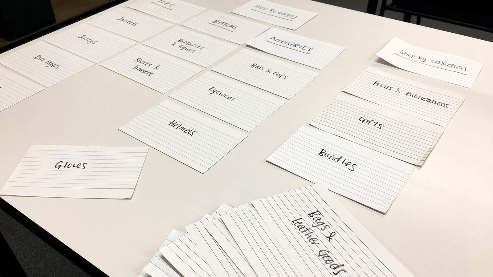
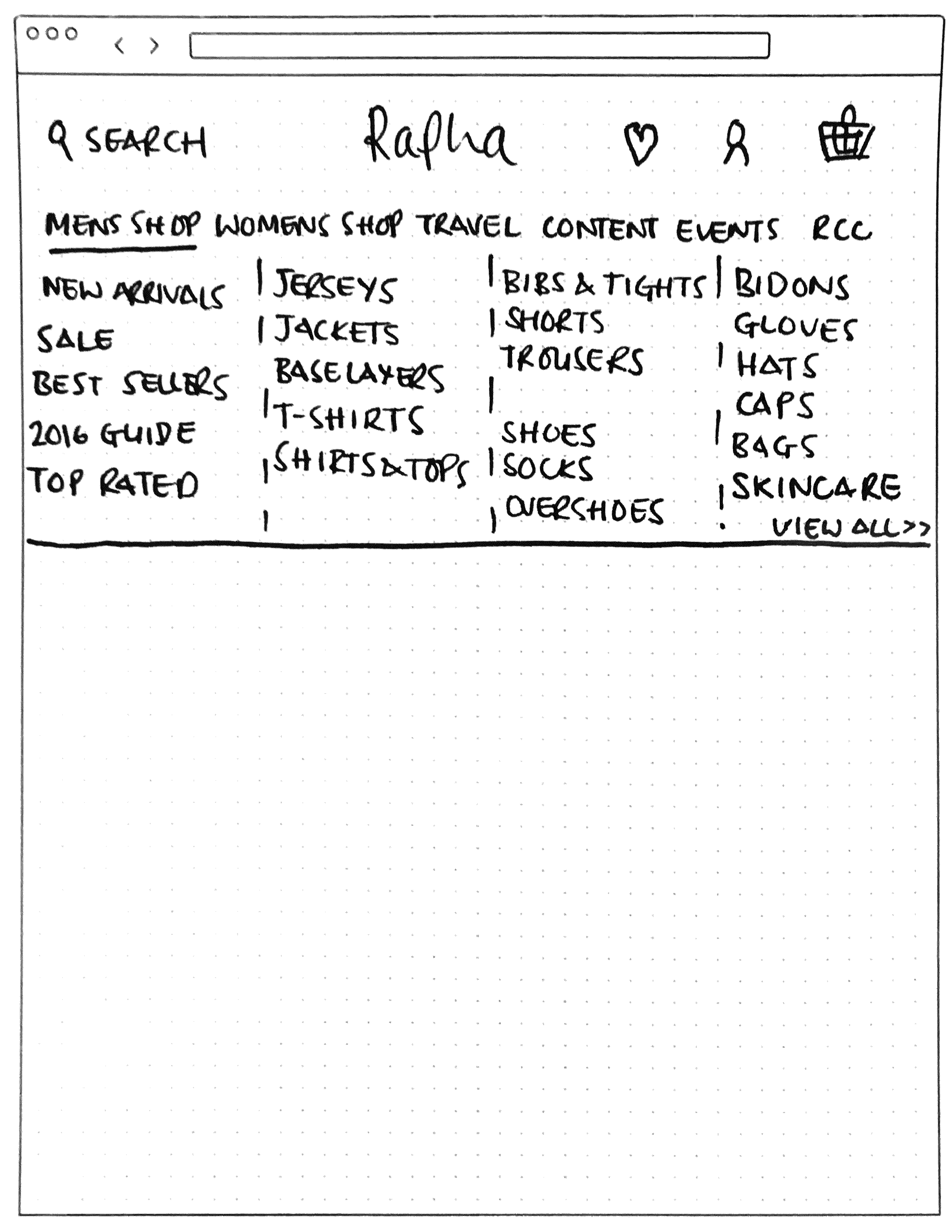
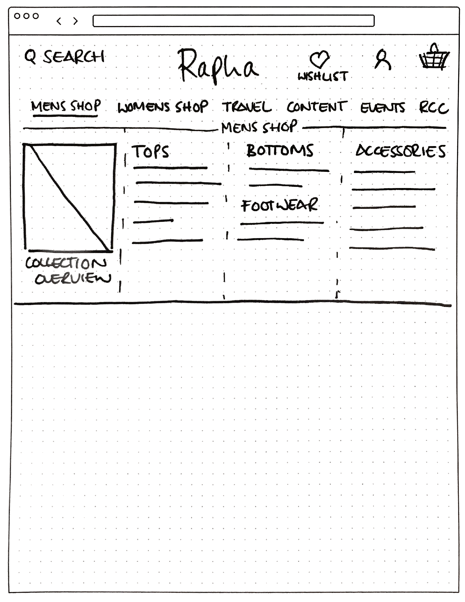
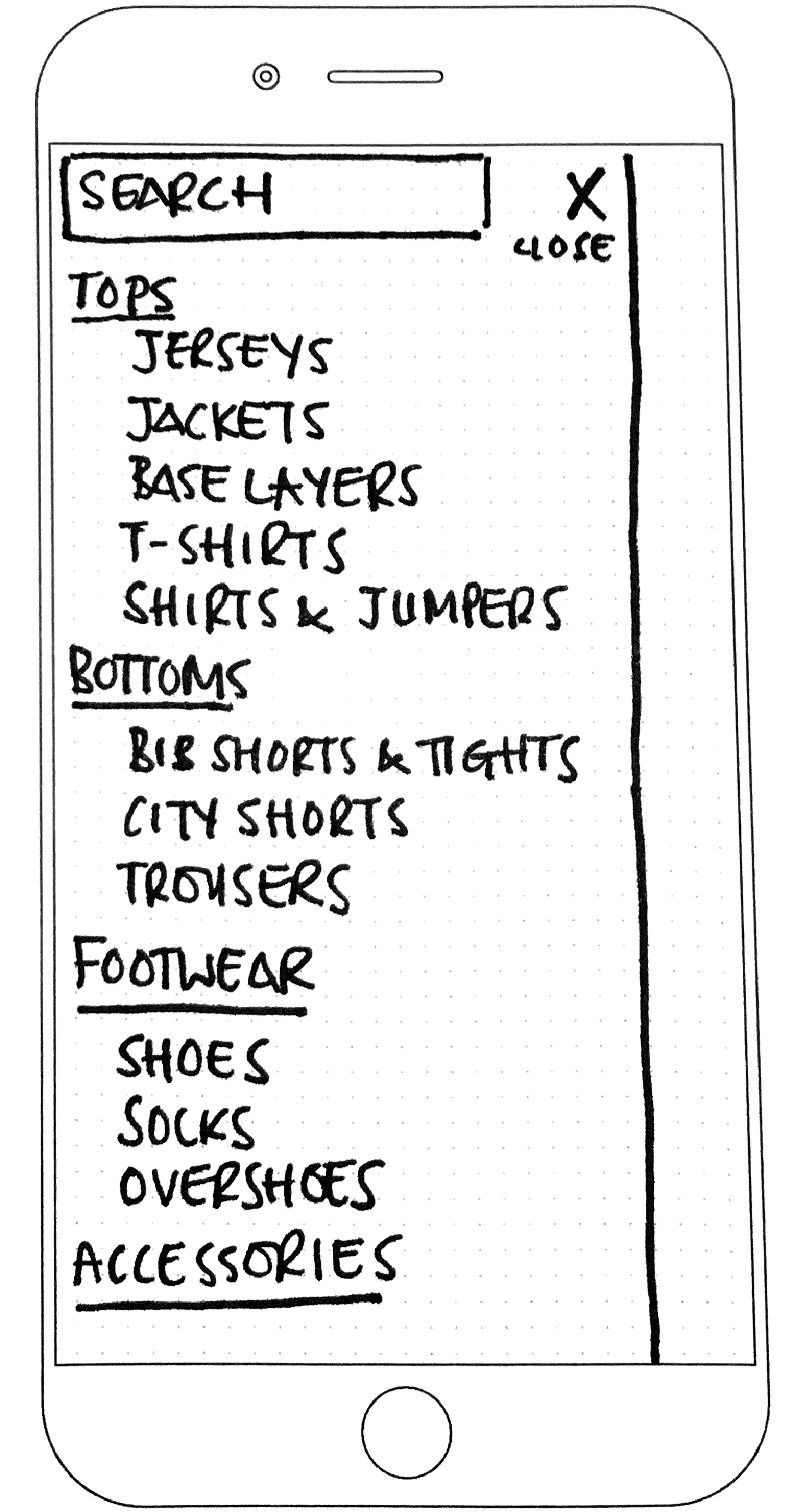
First off was to carry out a card sorting exercise, we got users to sort products into categories that made the most sense for them. Most users like the way that products are organised, not because they make the most sense but because they have used the site for many years and are used to the information architecture. In the card sorting we found that users didn’t really know what Riding Accessories meant, they wanted to see the sections within such as Bidons (Water Bottles) and Leg & Arm Warmers as separate headings. The other thing we found during the card sort was that users tended to group the products by area of the body, using Tops, Bottoms, Footwear, Headwear and Accessories as section titles that Jerseys, Bib Shorts, Shoes, Hats and Bidons could live under.
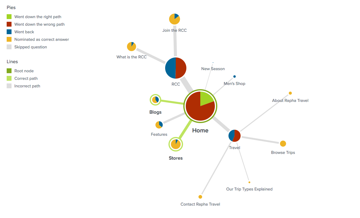
We used Optimal Sort to perform a Tree Testing exercise, this allowed us to set up a navigation heirachy and then ask users to perform various tasks, such as “If you wanted to buy a Jersey, where would you look?” This then showed us where our users expected to find items and gave us a lot of insight into the problem areas.
“Where would you expect to find an Essentials Case?”
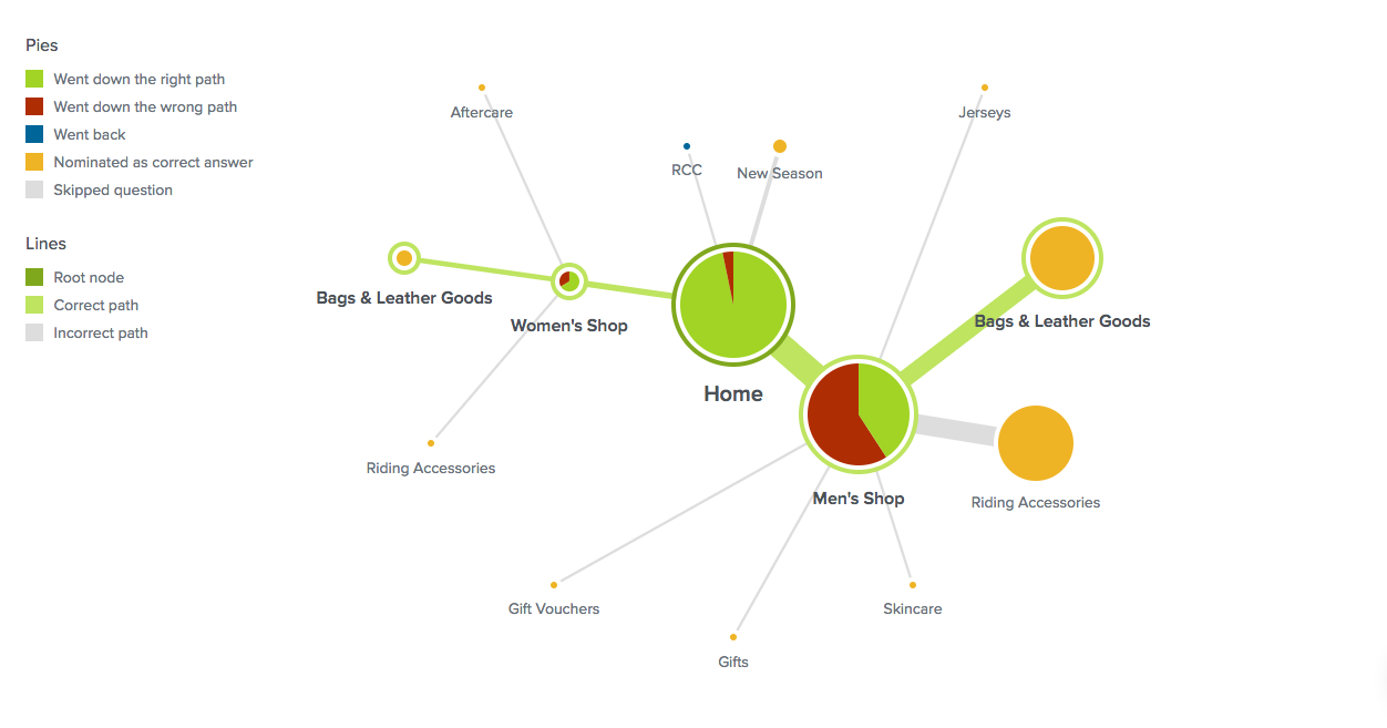
“Navigate to the section where you might buy a pair of Leg Warmers”
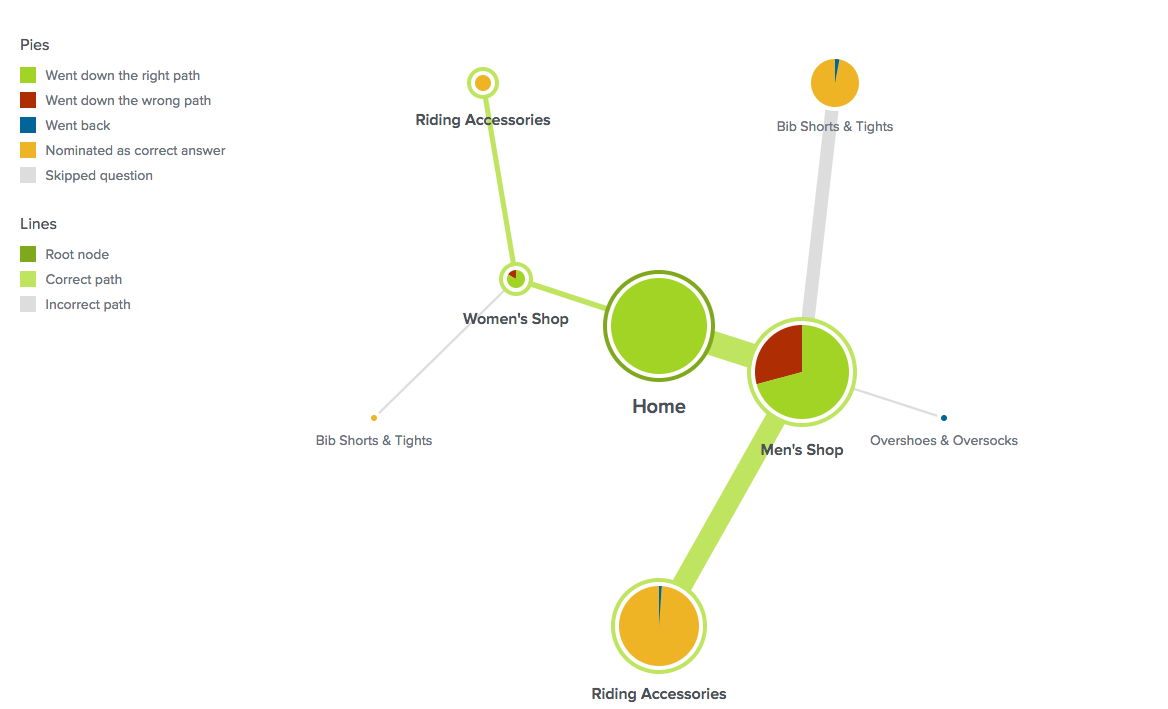
“If you wanted to attend a Rapha Event or Ride, where would you find out more?”
The Idea:
With more and more people joining the cycling revolution we need our product catalogue to be easy for new customers to understand. We know that “Riding Accessories” is a very confusing term as it could cover most items, users expect products to be grouped by type eg. Tops and that even though Rapha Events & Rides are a large selling point for the company, they are very difficult to find, even by the most seasoned Rapha Customers. By better categorising the products and changing the primary navigational headings we can make it easier for both new and existing customers to find what they are looking for.
Testing & Iteration

Testing initially took place with Rapha staff as we wanted to get the first set of sketches more refined before showing customers. The first iteration showed product categories broken down by type with the addition of multiple content slots to be used for highlighting offers or featured stories. This version was overwhelming, too much change and too many options were confusing so this was paired back considerably in the second iteration. After this feedback the design lead with the first column showing highlighted products or content with text links and then had the break down of products by type. This version was much easier for users to understand but still gave room for promoting content or products, iteration 3 was the same but using one content slot for featured content. Both iteration 2 and 3 were well received so we decided to create both versions for high-fidelity testing, with the view that they could both be used depending on marketing and merchandising needs at any given time. During testing it became apparent that all the primary navigation elements should behave in the same way. Currently we have a mixture of drop down and static elements, most feedback pointed to having all navigation elements as drop-downs to give consistency for users and also more flexibility for the business.
Iteration 1
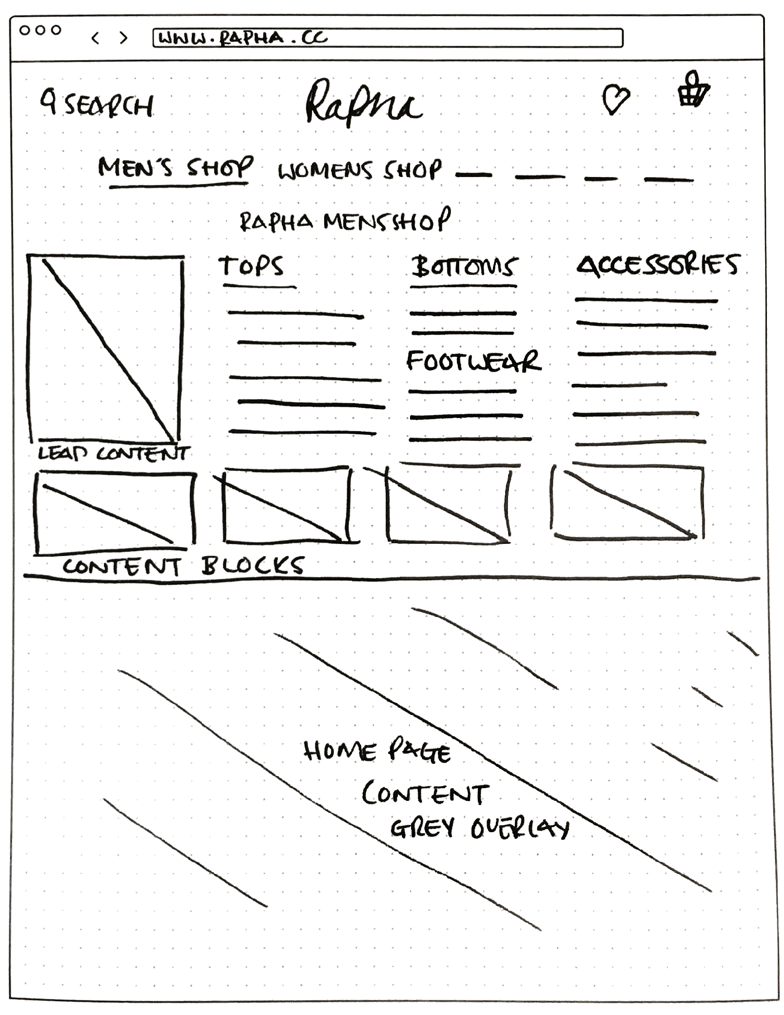
Iteration 2
Iteration 3
Design 1
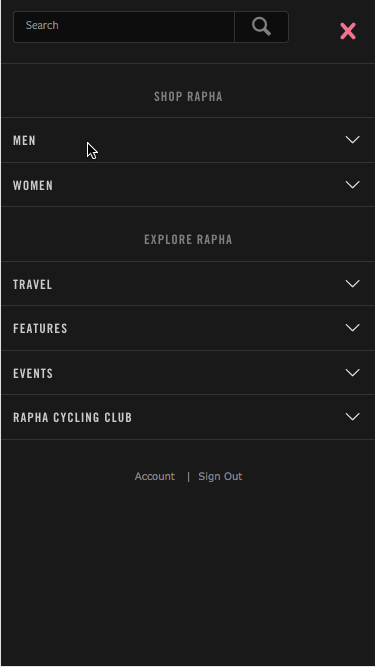
Mobile nav with one column
Design 2
Mobile nav with two columns
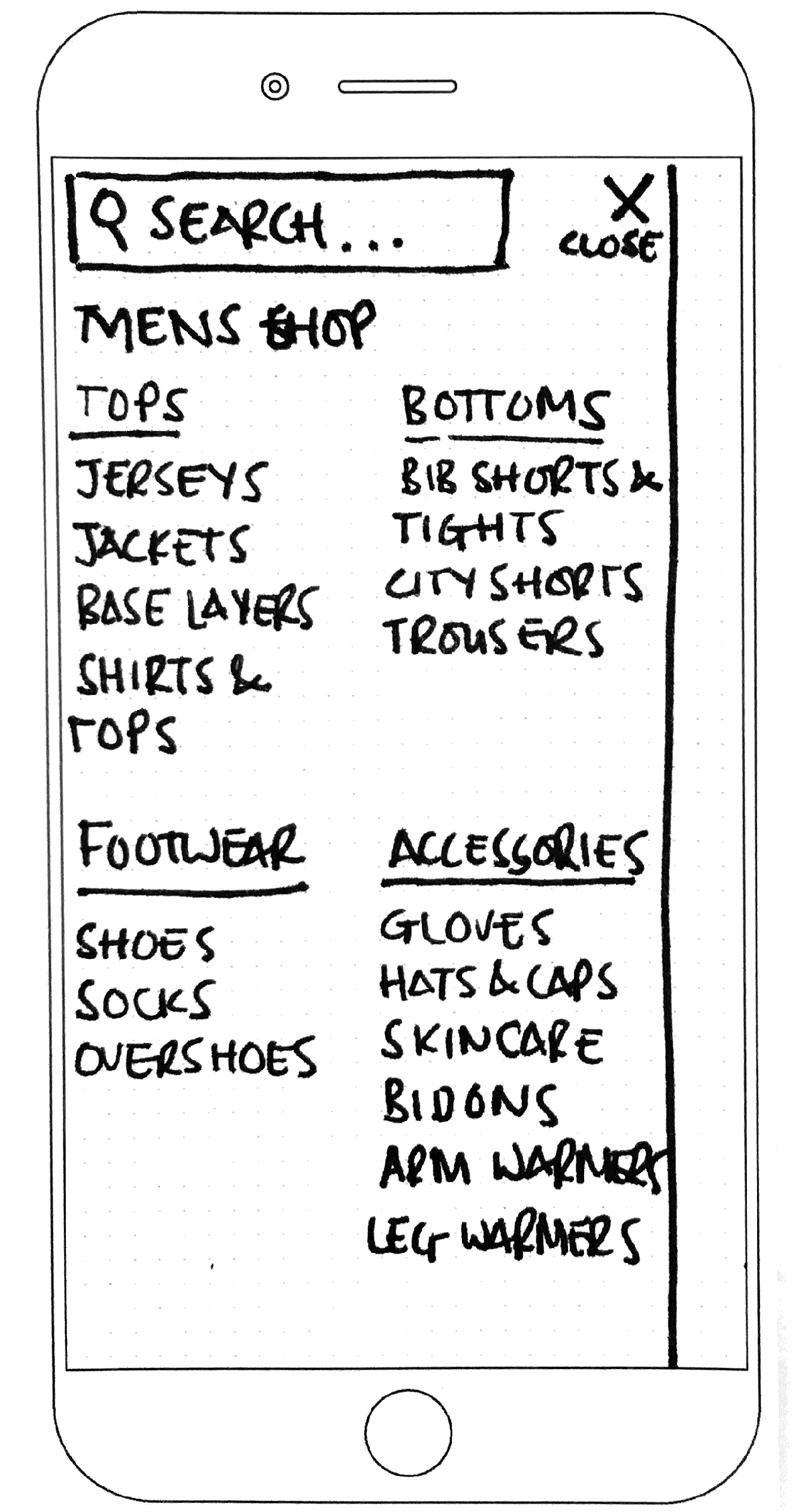
Mobile Screens
With the mobile navigation we developed 5 different hi-fidelity versions and created prototypes to be tested in store. Customers were really excited to see new developments on the site and get the opportunity to be involved. Designs 2 and 4 were the best performing during testing on mobile due to the simplicity and clarity of the designs. Customers really took to the reorganisation of product categories using the terms Tops, Bottoms etc. The reaction was split between designs 2 and 4, leading us to the decision to develop both so that they could be multi-variant tested on the live site.
Design 1
Design 2
Design 3
Design 4
Design 5
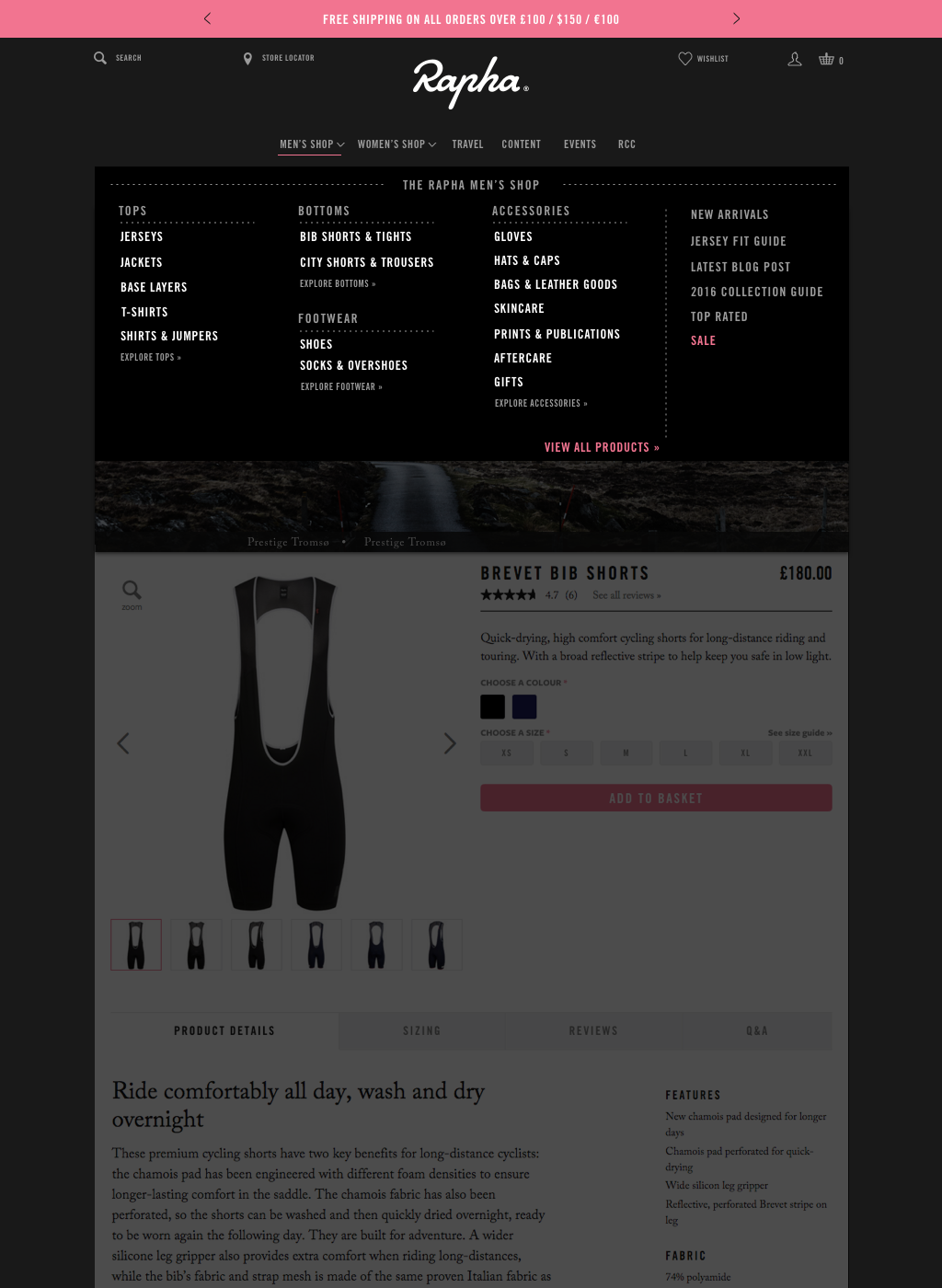
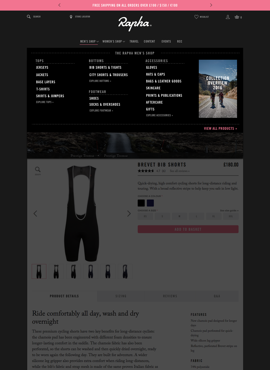
Final Desktop Screen
Design 1
Design 2
Design 3
Outcome
We have two mobile navigations that can be developed and multi-variant tested against the existing navigation on the live site. The Desktop version can also be A/B tested against the current version to make sure that these developments have a positive effect on interactions and conversion rates. We also have the flexibility to make changes to the desktop navigation by using either design 1 or 2 depending on the business need, such as sale periods or at the start of a new season.