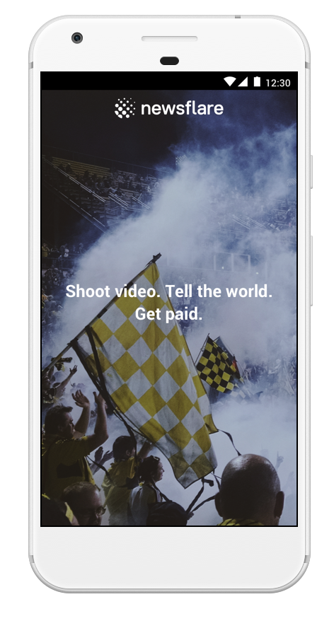
Newsflare had identified a problem with the Android app, they were receiving a high amount of uninstalls and inactive users, this was attributed to a poor upload experience. They wanted to improve the upload process, increase browsing time on the app and reduce the number of app uninstalls.
Through extensive user interviews and testing we were able to validate the issues surrounding upload and login but also uncover further dissatisfaction with the lack of content, features and community on the existing Android app. With this in mind we redesigned and tested the whole app, not just the issues outlined by the Newsflare team. The redesign included: User onboarding, easy to browse content, in-app video recording, improved upload and tagging process, improved account functionality and an area to inspire users on future video projects they could complete.
The Brief
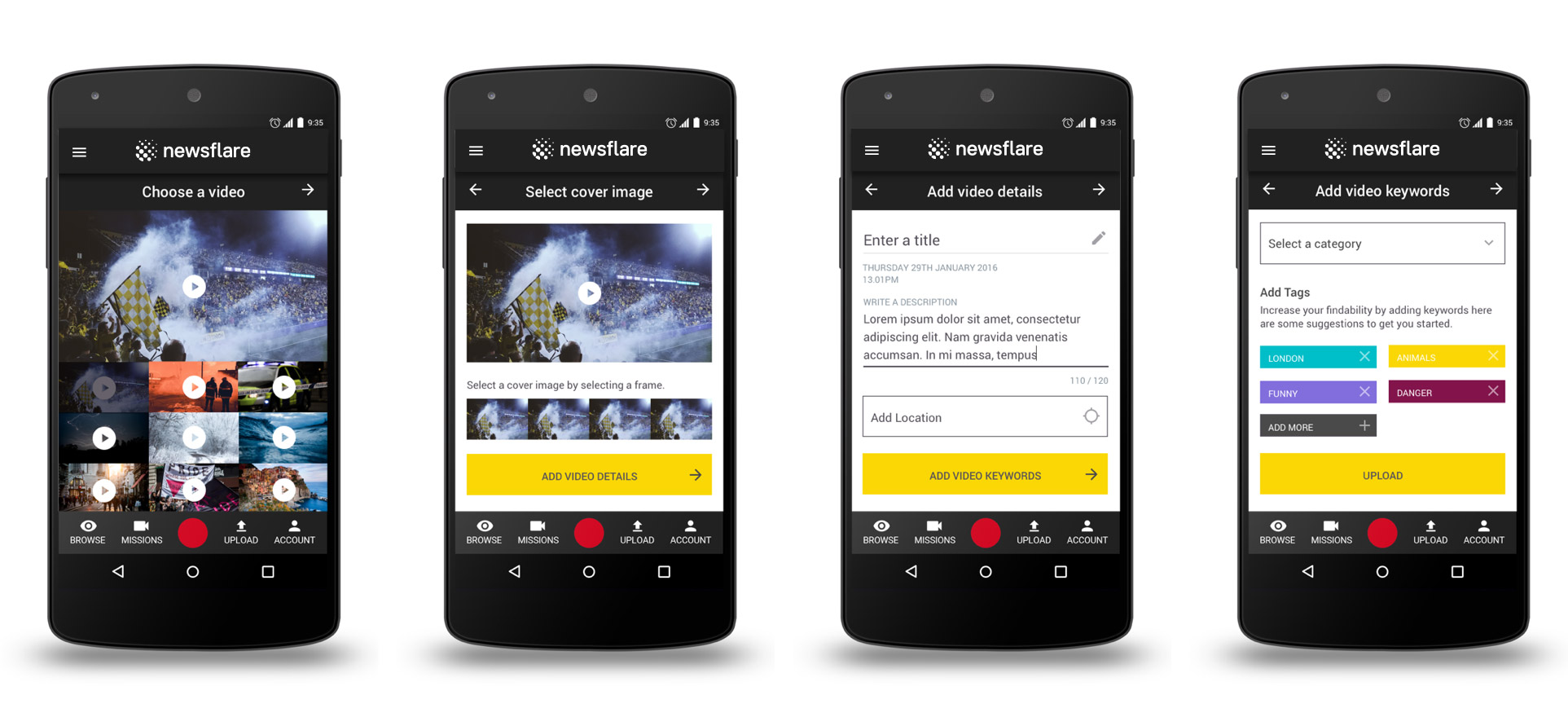
The Android Newsflare app has been identified as having a poor and clunky UX experience for uploaders; with the uploader having to go through multiple pages, entering a lot of information to enable a successful upload.
Newsflare’s key requirements are as follows -
- Show uploaders the ultimate benefits they will gain from the app .
- Make the login and upload process simple .
- Increase dwell time but decrease the amount of time to upload a video; making it easier.
- The Android app also experiences technical issues and the error messaging to users is not clear or informative.
Our users needs a way to upload a video with ease and speed because the video could be an important breaking news story. We believe that by creating a easy and quick upload process for our users we will achieve a greater retention rate of our users. We will know this to be true when we see an increase in video uploads, unique users and a decrease in App uninstalls.
Skills Used
Competitive Analysis, Task Analysis, Experience Mapping, User Interviews, Affinity Mapping, Feature Analysis, Personas, User Flows, Prototyping, User Testing & User Interface Design.
Software used: Omingraffle, Photoshop, Sketch & Invision.
Insight & Research
Newsflare provided access to their current android app users, this was really crucial in gathering insights into how they are currently using the app and any problems that they have encountered. We also spoke to people who hadn’t seen the app before to get unbiased feedback on the functionality. Once we had all the feedback from interviews we turned these into an affinity map which highlighted the similarities in users experiences. This gave us a clear indication to the problems most users encountered with the android application.
“It could do with being a bit more user friendly.“James, January 2017
A few key areas were highlighted during my interviews with key users:
Uploads: “It can often take ages to upload and it quite often fails but gives no indication.”
Login: “The login process is frustrating, I have to login every time I use the app.”
Content: “I’d like to see content on the app, I don’t think it has any at the moment.”
Features: “I visit the website on my mobile as that is a better experience and has more features than the app.”
Community: “If I could upload a video about an event in my area and see who else has uploaded videos on that event that would be useful. It would bring more of a community aspect to the app.”
Competitive Analysis
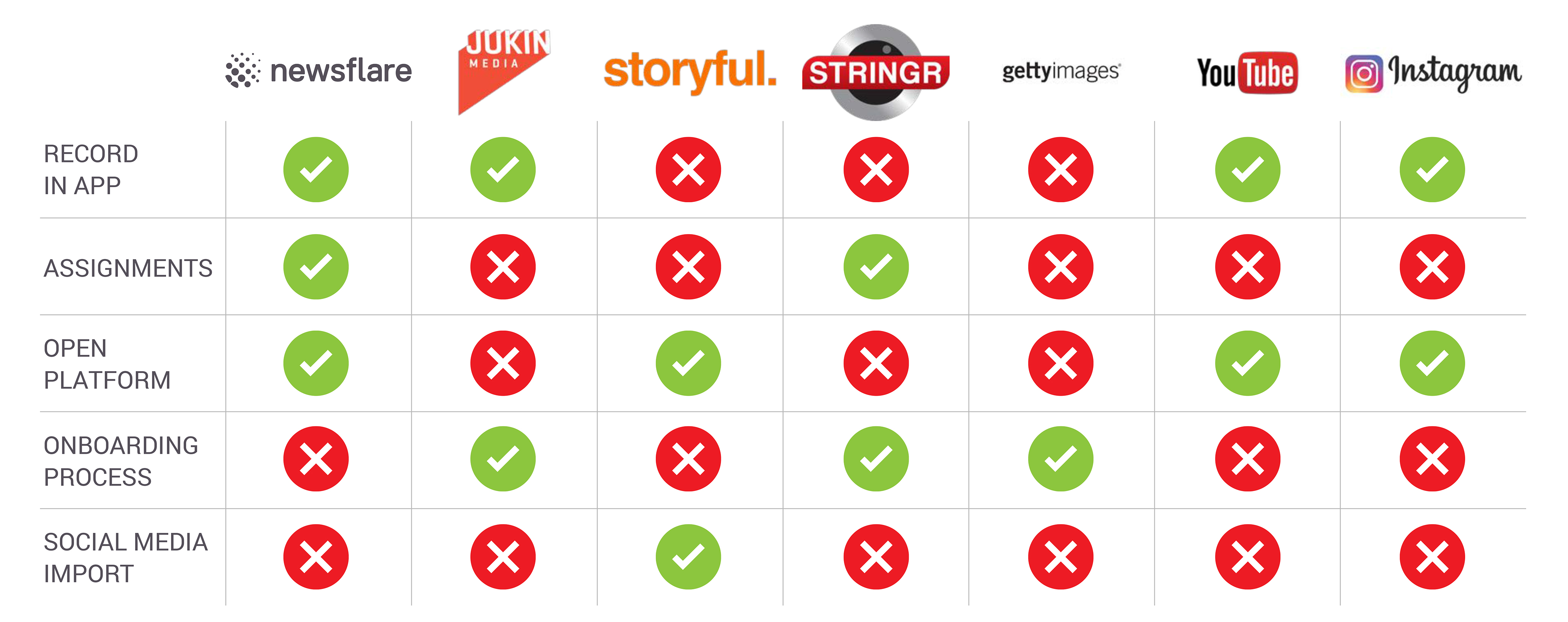
We looked at 6 different competitors, 3 direct competitors who occupy the same market as Newsfare: Jukin Media, Storyful & Stringr and also 3 indirect competitors: Getty, Youtube & Instagram to get a good overview of the the user generated media sector. We wanted to look at the features these companies offer either on websites or mobile applications. The following chart highlights that no one is currently offering a full service in this market and that Newsflare have an opportunity to give users a well rounded experience and offer inspiration for future video work.
Personas
From the user interviews, we were able to define three personas that typify Newsflare users; Carol: a mum of two in Ireland, James: a student living and studing in London and Geoff: an IT Consultant from Portland USA. Whilst all three of these personas are Newsflare’s users, Geoff is someone who is going to use all the features of the app and be more interested in Assignments to progress his work.
Carol, 32, Stay at home mum, Ireland.
“I recently started filming my kids and pets. My dog's really good at tricks so I film her on my mobile phone to show my friends and family. Newsflare contacted me after seeing one of my videos on YouTube.”Carol, January 2017
James, 22, Student, London.
“I love going around town and spotting events or incidents that I see and capturing it on my phone immediately and sharing it with my friends.”James, January 2017

Geoff, 35 IT Consultant
As a keen photographer and film maker, Geoff actively documents and shares his experiences through social media. Increasingly he has become a more active user of Newsflare. He likes looking at what other people have produced and at the quality of their videos.
“I love the outdoors and experiencing new places. I am a keen photographer and enjoy sharing my passion with others. I am always looking for new projects and Newsflare provides assignments which can help guide my craft.”
Behaviours
Typically will use social media to voice opinions on various subject matters he is interested in.
He is excited by the opportunity of being recognised for his video work and it being seen globally.
Frustrations
Lengthy process of uploading his video content.
Lack of guidance on how the Newsflare process works.
Goals
Wants to quickly upload his video content and get immediate feedback on his work.
Being recognised for his video.
Wants a quick payment turnaround.
Mapping the journey
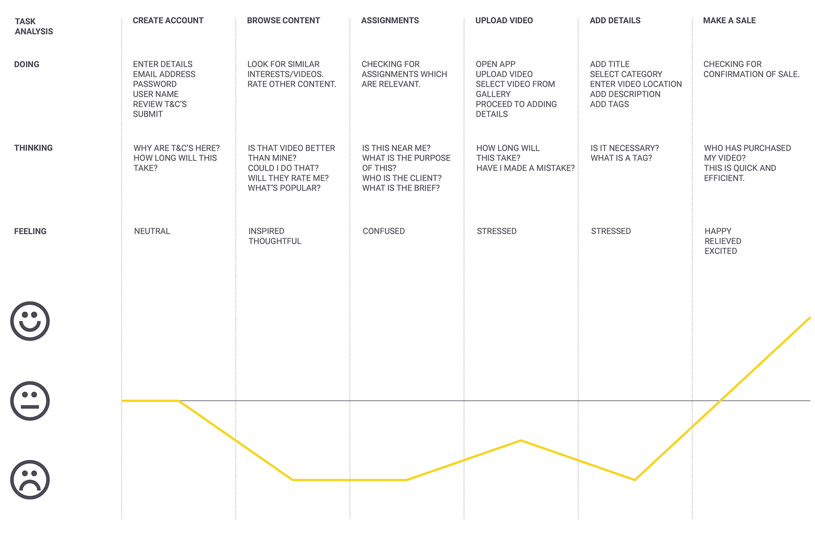
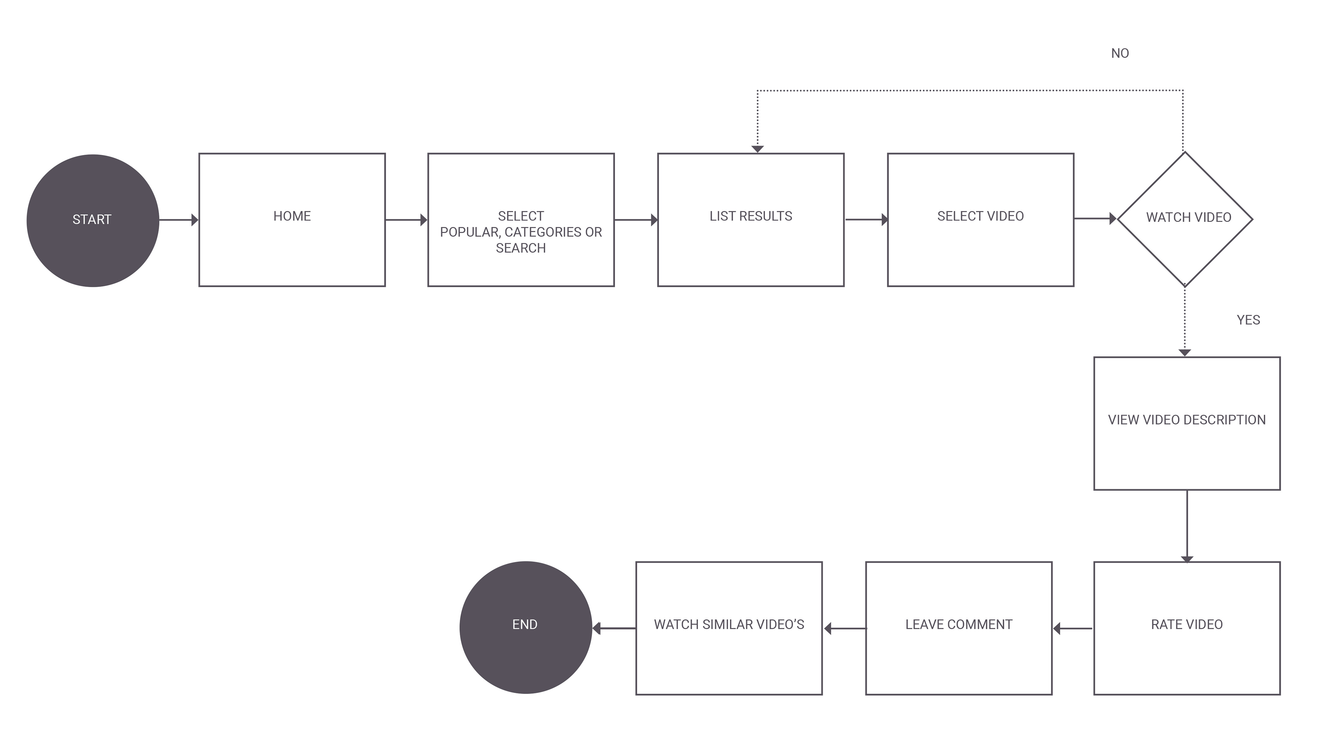
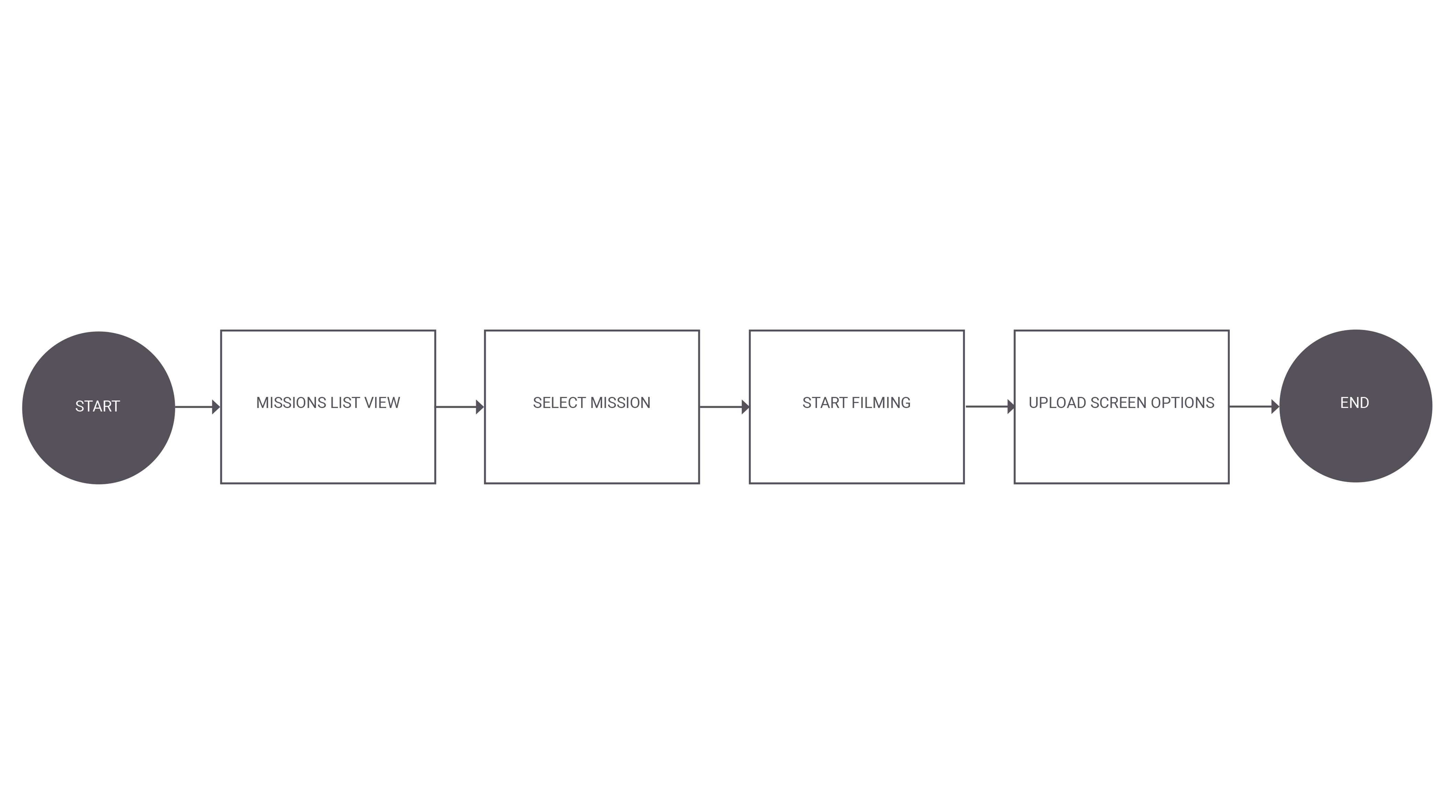
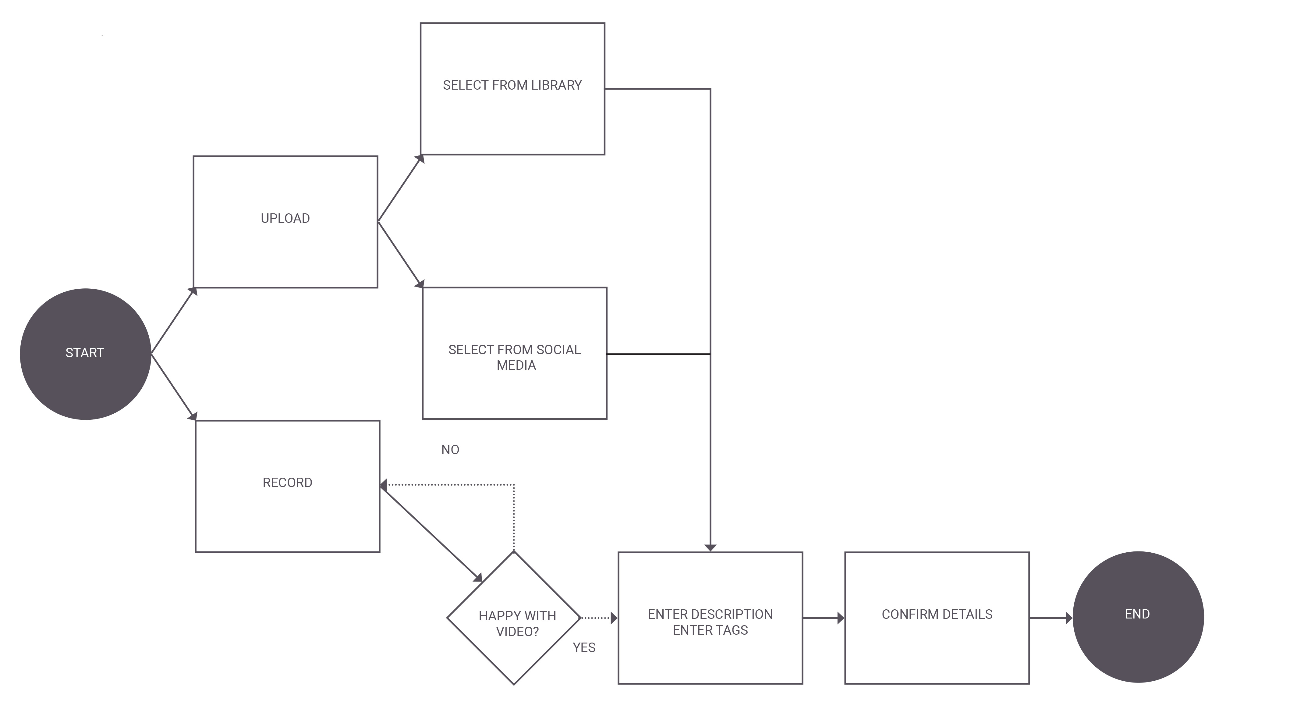
We undertook a task analysis to ascertain the different tasks that needed to be fulfilled in order for a new user to shoot a video, upload it to Newsflare and then make a sale. We also plotted the emotional state of the user whilst undertaking these tasks which is outlined in an experience map.
User Goal
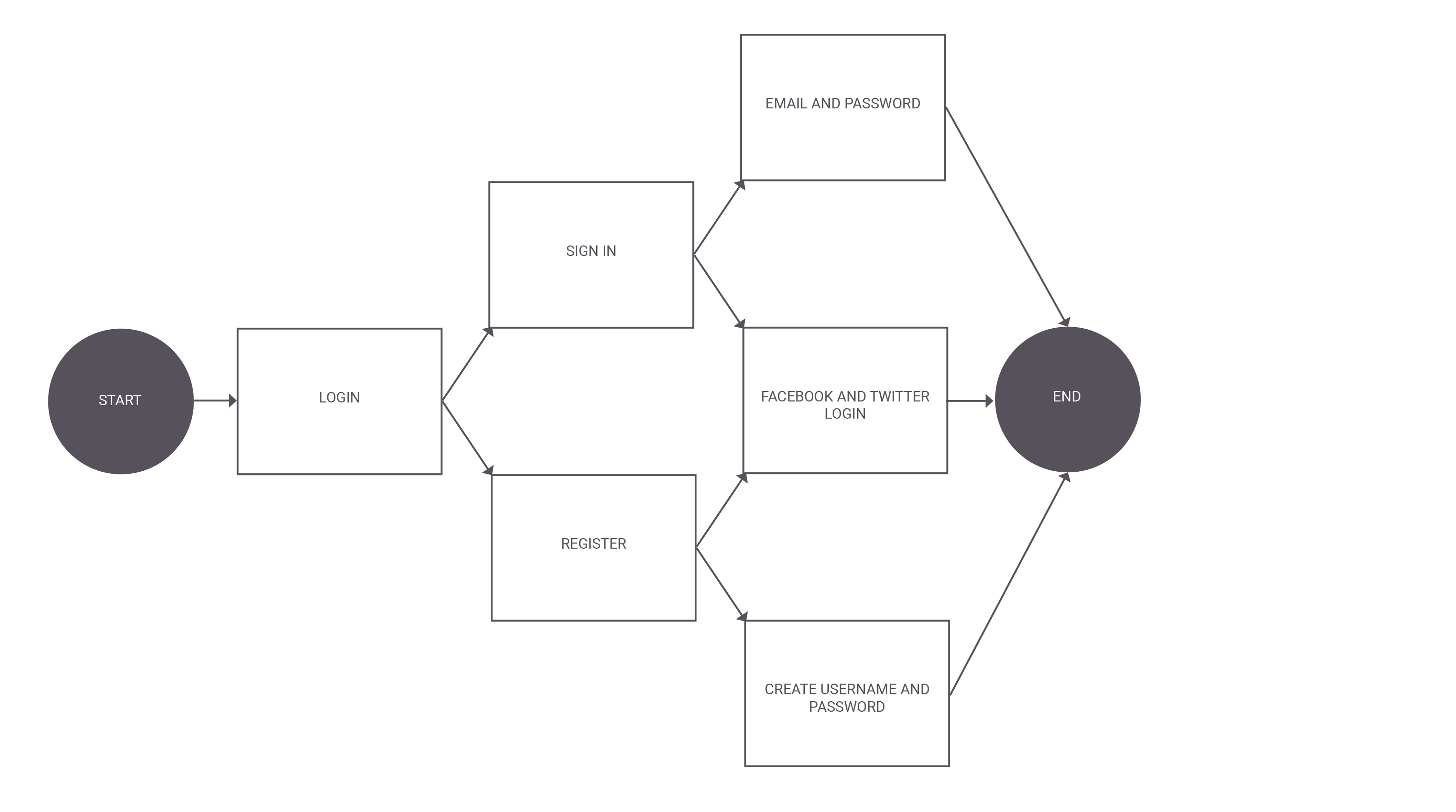
Login
Browse Content
Assignments/Missions:
Upload a video:
Feature Analysis
We ran a design studio with Newsflare to go through our competitor and user findings. We outlined the main issues that their users were encountering on the android app and the features they would like to see in a new version. We created a list of all the features both Newsflare and users wanted and prioritised them using the Must have, Should have, Could have and Won’t have but would like technique.
Must have:
- Easy to use
- Quick upload
- Inspirational content
- Simple recording function
- Clear relevant assignments
- Reliability
Should have:
- Notifications
- Keep me logged in
- Comment functionality
- Community aspect
- Auto completing tags
Could have:
- Guides & how to’s
- Suggested tags
- Clear account settings
- YouTube import/connection
- Easy access to contact details
Won’t have (but would like):
- Calendar
- Editing features
- Video notes
- Purchase/download video option
- Creating events in calendar
From this exercise we got a very clear idea of the features we must include in the redesign, and others that were of high importance. We will aim to address all of the Must haves and Should haves, and also the majority of the Could haves.
The Problem:
The Newsflare Android app was designed for users to upload their videos. We have found that the app is making this is difficult for users and causing them to default to the desktop version and not re-engage with the Android app.The Hypothesis:
We believe that by simplifying the upload and guiding users through the Android app, we will reduce upload times. By rethinking how assignments work and adding content which inspires users we will reactivate inactive users and increase browsing time on the Android app.Design Iterations:
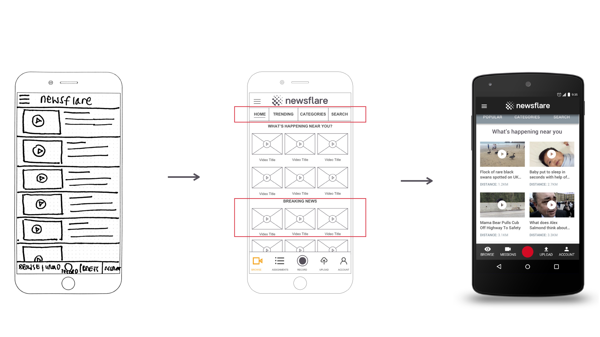
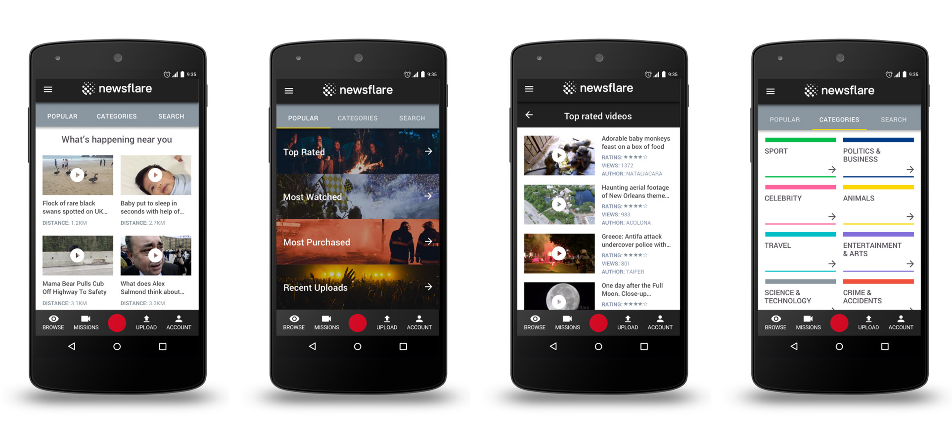
When walking through the prototypes with various users it became clear that some changes to the application needed to be made:Homepage: This was designed to have a long list of content that the user could scroll through, the first round of testing highlighted that our users wanted to see more relevant content so in the mid-fidelity versions we added a navigation for content: Home, Trending, Categories and Search. These would allow our users to quickly access the information they wanted. We also made the homepage more relevant by making the content location based in “Whats happening near you” and also time based in the “Breaking News”, this also changed the layout into a grid format so users could get a better snapshot. In the hi-fidelity version we added the distance of the video to the user, testing showed that this information was really important to users. The grid layout was changed to only show two videos on a row, users found that three videos looked cluttered and small. Finally we rationalised the content navigation to: Popular, Categories and Search. The home button was not needed as users clicked browse on the icon bar if they wanted to return home, also testing showed that “Trending” was confusing and “Popular” was a better choice.
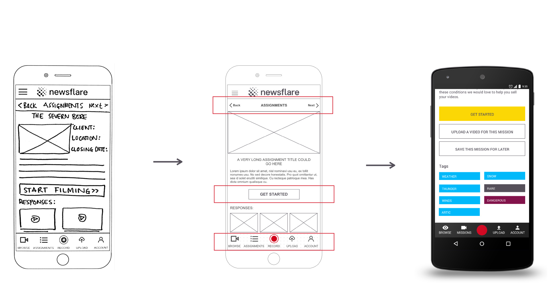
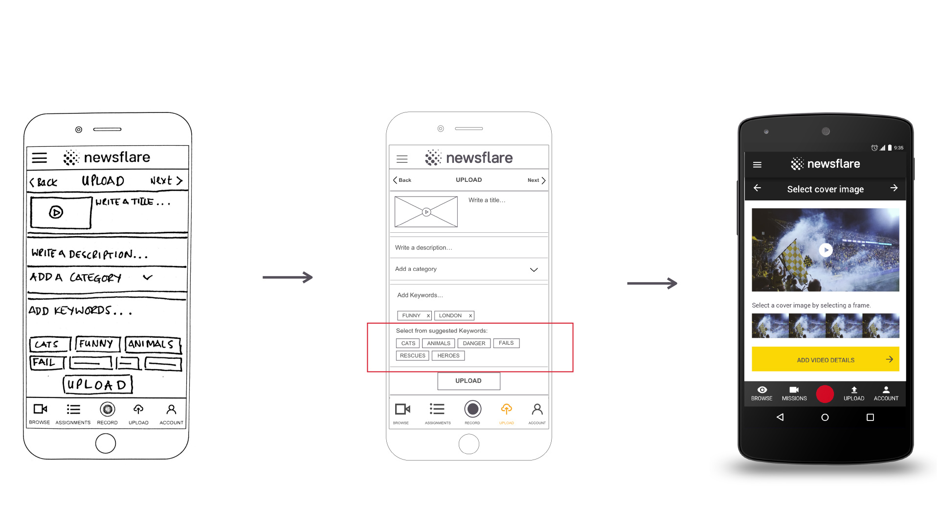
Design:
Newsflare have had a new set of brand guidelines recently made for them, we took these guidelines into careful consideration when designing the Android app as we wanted it to be consistent with the Website and iOS App. We kept the colour palette but added three extra colours for call to actions and error messages, these had not been outlined in the guidelines and we thought it important that we have them to give users clear feedback.We used Material design for the choice of Iconography, this was to make sure that this app was in keeping with the Android experience and that users were familiar with this style of icon so the navigation would be second nature to them. The Typeface was changed from Arial to Roboto, this again was to re-enforce the familiarity of an Android experience, it is specially designed for a smaller screen so legibility is very good but it also has a friendly rounded nature that makes it accessible.
The layout of elements was carefully considered, the app needed to feel balanced and not overwhelming so we followed the Material Design principles for sizing, spacing and navigation. This really made the design feel Android specific and gave users consistency which made the app feel much more trustworthy and legitimate than it had previously.
Browsing Content
Uploading from library
Prototype
Here is the finished prototype that was delivered to Newsflare on completion of the project.
Outcome
We designed a fully fleshed out prototype of the Android app, which addressed the issues originally laid out in the brief, such as upload flow, recording function & sign-in process. We added multiple ways to browse content, an onboarding process to help users fully understand Newsflare and a better experience for users wishing to take on projects in the Missions section.
Next steps
Whilst the product will solve the key user issues, if I had further funding I would propose the following next steps:
- Tutorials section on top tips on filming
- Test client-only rating system for more trust worthy results
- Investigate forum for Newsflare users
